
- Tägliche Fallzahlen:
- Data Journalism:
- Österreich:
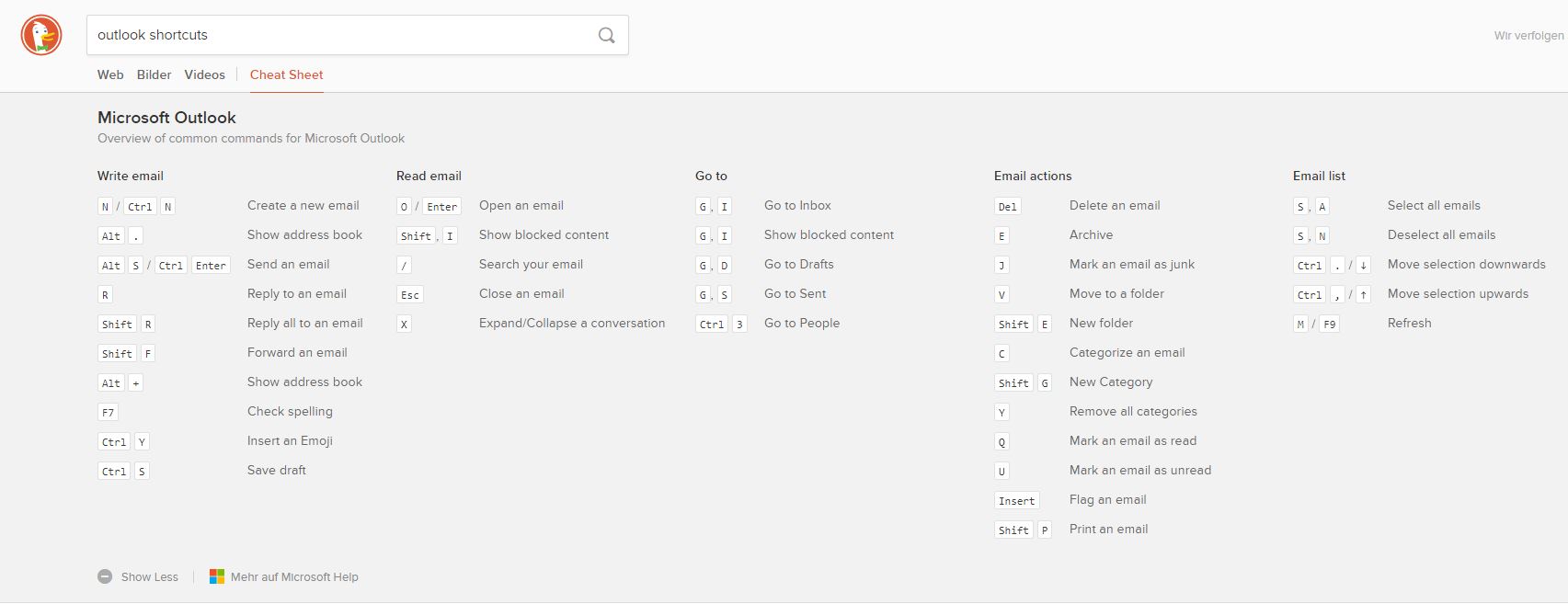
Fürs Wechseln zwischen den verschiedenen Ansichten in Microsoft Outlook gibt es die logischen Shortcuts:
| Strg + 1 | |
| Kalender | Strg + 2 |
| Kontakte | Strg + 3 |
| Aufgaben | Strg + 4 |
| Notizen | Strg + 5 |
| Ordner Liste | Strg + 6 |
| Verknüpfungen | Strg + 7 |
| Journal | Strg + 8 |
Nette Idee: Sofortantwort in DuckDuckGo Suche aus der DuckDuckHack Community, generiert ein Cheatsheet aus den MS Tastenkombinationen:
It’s been quite some time since my last trip by train. Recently I went from Vienna to Vorarlberg and although the time for the trip has been reduced over the years, it still takes 6 hours, enough time to contemplate some impressions from the digital experience that is offered by the ÖBB.
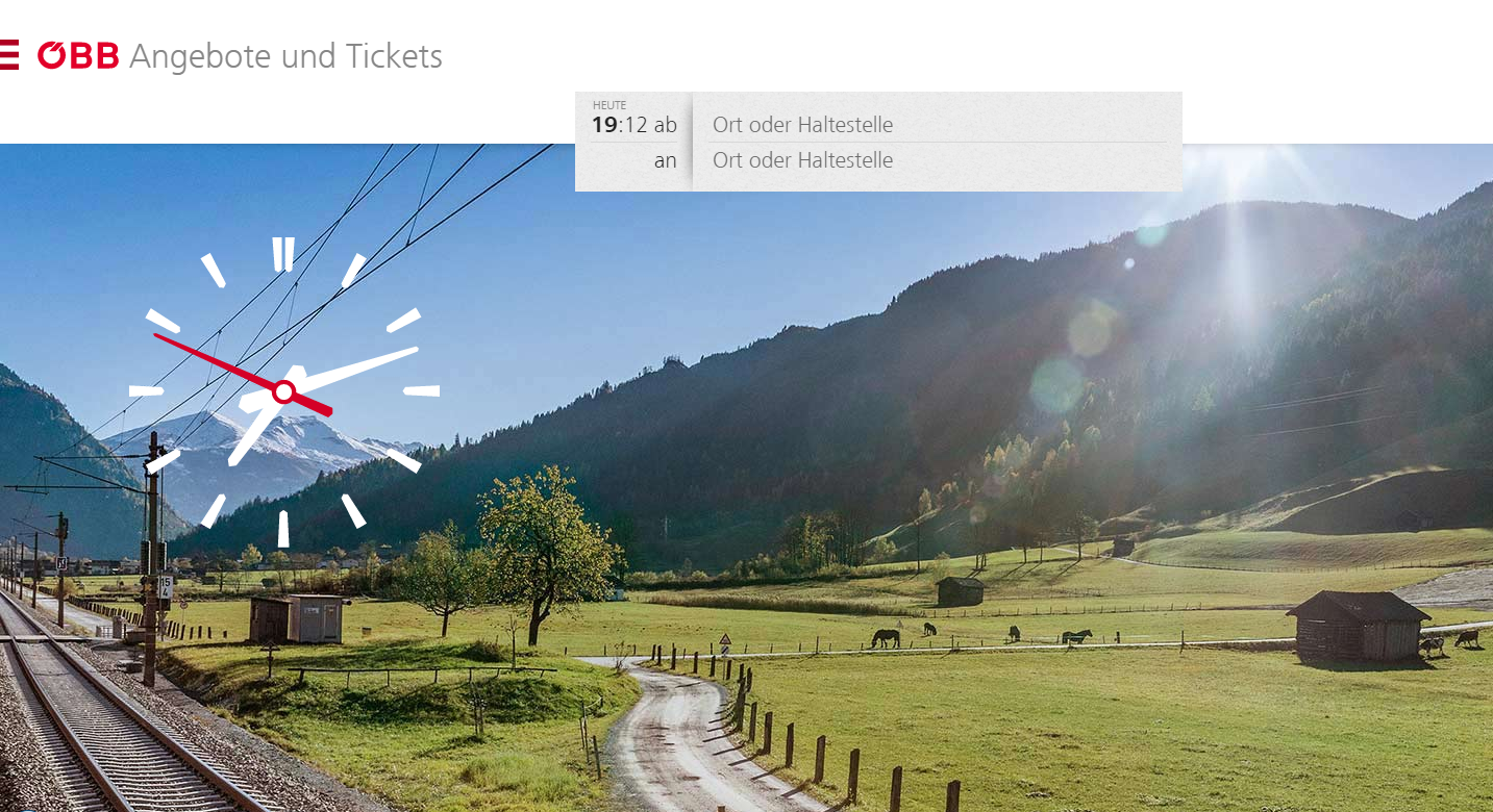
The above screenshot shows ÖBB’s ticketing website on a desktop screen. It’s no longer a mobile first approach, it’s a mobile everything approach.
Interaction on the mobile screen is so much easier and more efficient than the oldfashioned options-everywhere show-off what we got way of doing bigger screen designs. It is logical and practically common sense to extend the mobile design beyond smaller devices.
Compare with neighbouring Swiss Railways SBB:

Besides the strange idea to place a google ad for something else to buy on a ticketing page the overall impression is familiar but hopelessly outdated – at least in comparison to the ÖBB site. How old fashioned do two layers of navigation look in a tiny fontsize, and what exactly is the sense behind teasers teasing the user into what? Buying tickets for a trip from A to B?
Enter the functionality from the ÖBB site:
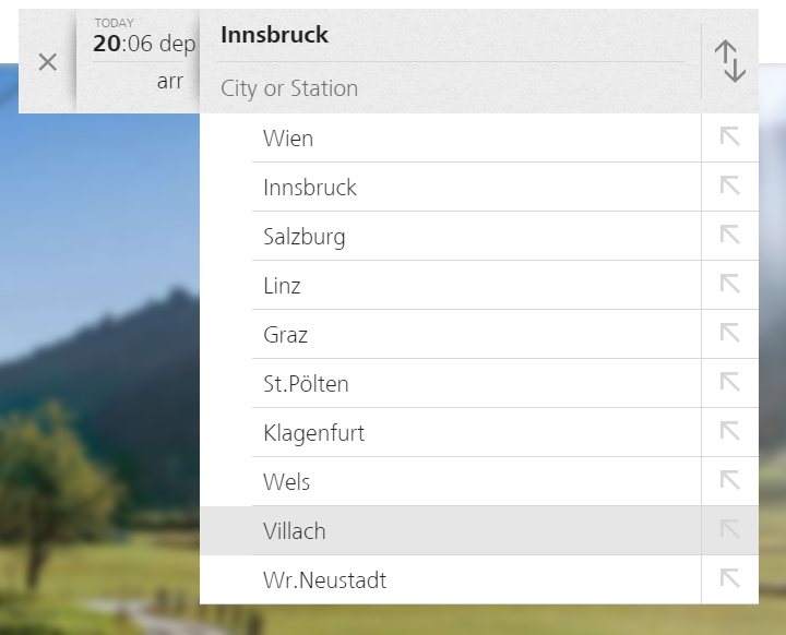
Getting the relevant information instantly when it is requested. Everything else ist out of sight but just one click away via a neat burger menu:
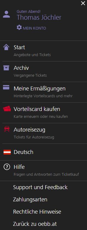 Clean Icons, Frutiger Next as the corporate font guiding the way to secondary usecases and personalised history of previous purchases (hello frequent customer).
The overall experience on the desktop is a reminder that mobile & touch have blown apart the old fashioned fixed width designs, stuffed to death by boxes, filled with content and noise.
It is a design that helps the customer getting the job done.
The digital experience doesn’t end here. Once you get on the train (a Railjet in my case) you find a free WIFI that is actually working really well with very few interuptions and good enough bandwith for watching The Magnificent Seven on Netflix.
The printed onboard magazine makes it clear, that the digital agenda at ÖBB is a strategic goal and going to the core of the business case. Still it is uncommon to report from a beta phase with critical feedback in your own corporate publication, but it shows the commitment to a deeprooting change and a usercentered approach.
Just a small detail with some room for improvement is this infographic in the onboard magazine:
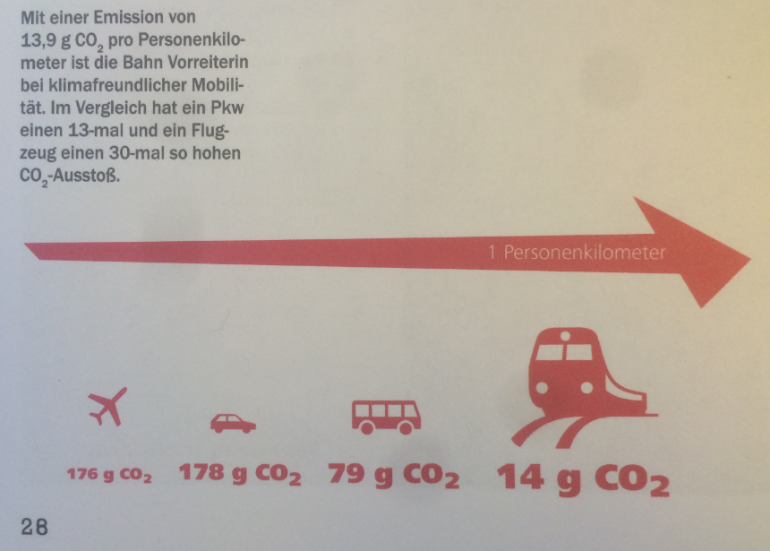
The highlighted factor is the reduction von gram CO² – but the order, the arrow and the pictograms show a ascending tendency when a descending order would be more correct. A good old fashioned bar chart would be much better…
But besides that last note from my other self as a lector on datajournalism the overall digital and design experience on the whole customer journey was unawaited and impressive. 21st century, here we go.
I completely agree with Gerry McGovern on
Insight led by data not gut instinct:
In complex worlds, like the one we live in, things change very quickly, and things get very complicated very fast. What’s more, things make less and less common sense. Complexity and counter-intuition are twins. Advanced science and mathematics are crazy worlds of confounding ideas.
To succeed in our complex world we will increasingly be required to develop insight through data and evidence rather than through gut instinct.
One prerequisite though for insight through data is the availability of that data. The open data movement comes to one’s mind and so do two very recent examples of missing official data that provide crucial insight into current events.
(1) The Counted: People killed by police in the US, recorded by the Guardian – with contributions by the Guardian’s readers. The Guardian decided to start collecting the data as no official data is available:
The US government has no comprehensive record of the number of people killed by law enforcement. This lack of basic data has been glaring amid the protests, riots and worldwide debate set in motion by the fatal police shooting of Michael Brown, an unarmed 18-year-old, in Ferguson, Missouri, in August 2014.
(2) The Migrant Files: A consortium of journalists from 15 countries provide data on the human and financial costs of Fortress Europe. Stories from the intensive recherche project include Money Trails and Counting the Dead.
By compiling rigorous datasets from various sources, The Migrants’ Files team aims at creating a comprehensive and reliable database on migrants’ deaths. (…)
A consistent methodology is applied to all data, starting with so-called “open-source intelligence” (OSINT). Originated by the intelligence services, this approach collects data from publicly available sources such as media reports, government publications and grey literature. (…)
The journalists of The Migrants’ Files noted that the various data sources often lacked compatibility since each organization structures its intelligence differently. This required extensive data cleaning and fact-checking, using OpenRefine, an open source analysis tool. In a second stage, The Migrants’ Files journalists established a database on Detective.io, a web-based tool specifically designed to support information gathering efforts for large-scale investigative reporting projects. (…)
The Migrants’ Files database of emigrant deaths now structures the data according to name, age, gender and nationality. Every fatal incident is recorded with its date, latitude, longitude, number of dead and/or missing as well as the cause.